Description
I am using custom CSS (under the branding tab) to customize the registration page: Webinar Registration - Zoom
I am accessing the registration page through an approved vanity URL.
CSS works well for big screens (like FHD+ or 1920px width +) BUT it doesn’t work for devices with smaller screens.
As I see, the tag which embeds/generates with custom branding CSS for 1920px + screens is not embedded/generated for smaller screens.
I am not sure if this is a bug or if I do something wrong.
How To Reproduce (If applicable)
Access url using a screen with a size >=1920px :
You shouldn’t see any image as they are hidden with CSS in the tag.
You can search (in dev tools) for the tag by for example “webinar_custome_logo2” CSS class.
Access the same url using a screen with a size <1920px.
You shouldn’t see that images now are visible and there is no tag with a custom branding CSS.
Thank you for reaching out to the Zoom Developer Forum. Please send an email to our Customer Support Team as they will be able to assist you directly with this issue.
Thank you for the update. I’m sorry to hear that, I certainly don’t want to send you to them if they aren’t able to help. I’m happy to help however I can but for the most part, what is in the Zoom Portal, as well as custom CSS, is outside the scope of our support here.
That being said, I was able to reproduce this behavior when using the standard registration page so it looks like this is the expected behavior on smaller devices in order to ensure that all information fits on the page. If you would like this changed in a future release, I recommend reaching via our feedback form.
Thank you for your feedback, Max. I appreciate your help.
It’s not understandable for me in case it is really normal behavior. In this case, the whole concept of custom branding is gone for devices with smaller screens… That’s a service we pay for as users in our plan. And now it looks like this service is not fully provided.
Is there any way you could think of to check if that’s for sure the correct behavior of custom branding CSS?
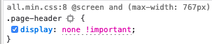
Thank you for the update. I was able to confirm this is expected behavior by watching the .page_header.custom_logo div on the standard registration page. When first loading the page, we can see that this element is shown on the page:
After reducing the size of the page to a mobile device, we can see that the following CSS rule is applied to the div element:
As you can see, that rule hides the element with a built-in CSS rule. You can try to override this rule using your own display property with an !important directive in your rules to see if that allows you to display the logo.
Hi Max. Thank you for taking close look on the issue!
May I ask you whether you reloaded the page after resizing the browser to mobile width?
I am asking because when I reload the browser for mobile size screens or load through a mobile phone
I don’t even see divs with .page-header or .custom_logo classes anymore.
They are not even loaded for small screens.
I see different tags with different classes which load header and logo. And tag with all custom CSS is not loaded
Thank you for providing the CSS that you’re using. Initially, when testing this, I grabbed the CSS from your account and saw the same behavior on my end. I also tested with the registration URL that you provided.
I looked into this a bit further and was able to confirm some details.
When loading from a mobile user agent, the page has a different formatting. the .page_header element doesn’t exist and is instead replaced with a .webinar_topic div that acts as a header and displays the Webinar title.
I also saw that when resizing a desktop browser and refreshing the page, the .page_header element still existing on the page.
From here, I would try rolling back the CSS changes that you’ve made to get a good feel for how the page behaves by default. From there, you should be able to override the desktop and mobile styling in order to display the logo.
If not, you can also place it somewhere else on the page depending on what device and size the registration page is designed for.
I understand that this is a bit of a hassle when attempting custom branding. If you would like different behavior added, the best place to request it is via our feedback form. You can also submit a post in our #feature-requests category.
Hi Max. Thank you for your attention to this ticket.
I am a little confused because I see you are saying that “…page_header element doesn’t exist and is instead replaced with a .webinar_topic div…” so you don’t see the div but at the same time you see it “…and refreshing the page, the .page_header element still existing on the page.”
I checked many times again and with other people and I still can confirm that on my registration pages on small screens there is no .page_header (=> .page-header ) as well as CSS style for this element.
I also checked again and again.
Anyway, I am looking for help first of all with hiding images on mobile screens. Maybe I could suggest you another approach to have a look at the issue.
May I ask you for one confirmation and one advice with CSS?
1 (confirmation). I added this CSS to test the behavior: .webinar_topic {outline: 5px solid red;}
Can you see an outline on the registration page? Webinar Registration - Zoom
2 (advice). What CSS would you recommend to hide images before (or above) the form?
I meant that I was opening Chrome, entering the responsive testing tool and then refreshing the page. When doing this, I saw that there is no .page_header element created on the page. Instead, the header element starts with div.summary > div.webinar_topic
Conversely, if I open the page in a desktop browser, resize the browser and refresh the page, I see that the .page-header element is always in the DOM, just hidden on the page at a certain size.
No, when looking at your registration page, I don’t see a red outline. I do see a red outline when I apply that same CSS rule to the default registration page.
When you mention hiding images above the form, do you mean only on mobile devices? I see when accessing your registration form on a mobile device that the following images are displayed:
Maybe that’s the reason why I can’t hide images on mobile phones as well using custom branding CSS? The style doesn’t apply to the registration page for small screens, beacsue, as you noticed, Zoom is loading different html elements including different internal CSS styles. But it should apply as per Zoom registration page customer branding guides.
Btw, what default registration page you mentioned? What’s the link to this page?
Yes. I want to hide images on both: desktop and mobile screens.
But you can see images on mobile because Zoom custom branding CSS simply doesn’t work on mobile screens (which is totally wrong). As you found as well, Zoom loads different html elements for mobile screens, including different internal CSS, so it doesn’t load the actual custom branding CSS which I add under the Zoom Branding page
Thank you for the update. My understanding is that while the page formatting is different on mobile, you should still be able to apply custom CSS. If you’re seeing that none of the custom CSS that you write for the mobile view is working, that definitely could be an issue on our end. Let me know if you’re able to style the mobile layout at all.
In the meantime, I’ll test this on my end and see if I can provide some pointers on using CSS across desktop and mobile.
I’m just creating a new registration required webinar on my account, with no custom branding, and testing the behavior of the registration page there. You can try saving your changes to another location and then restoring the text fields on the branding page to test with a default registration page.
Hi Max.
I would like to confirm that none of the custom CSS that I write for the mobile view is working.
I totally agree with you that it looks wrong and there could be an issue on your side.
Also thank you for clarification with the default registration page.
I also checked the registration page without vanity url and I still don’t see applied custom CSS for mobile ((
Additionally, as I understand based on Zoom guides to custom branding, that custom branding and custom CSS can be applied only to registration pages access through vanity url (sorry if I am wrong).
If there is another to apply custom CSS to make it work on the mobile phone as well, I would like to ask you to share it with me, so I could use your approach while your team is checking the discussed issue above.
Thank you for your patience while I looked into this. I was able to reproduce this issue on my account today.
With branding and a vanity URL enabled, I added a Banner Image and a Logo through the Webinar Settings page. Then, I added custom CSS to hide the images.
I saw that the CSS that applied to the Desktop site, worked at hiding the banner image but CSS was not applied when viewing the form from a mobile device.
From here, I’m working to determine the best internal resource to reach out to in order to confirm if this is a defect or expected behavior. I’ll be sure to update you as I have more information.
I’ve since submitted a ticket with an internal resource in order to gain insight into the issue we’re seeing here. I’ll be sure to update you when I have more information. (ZOOM-255639)

