Description
Error
This is Phone
But I set
<meta name="viewport" content="width=device-width, initial-scale=1, maximum-scale=1, user-scalabel=0">
Which version?
To Reproduce(If applicable)
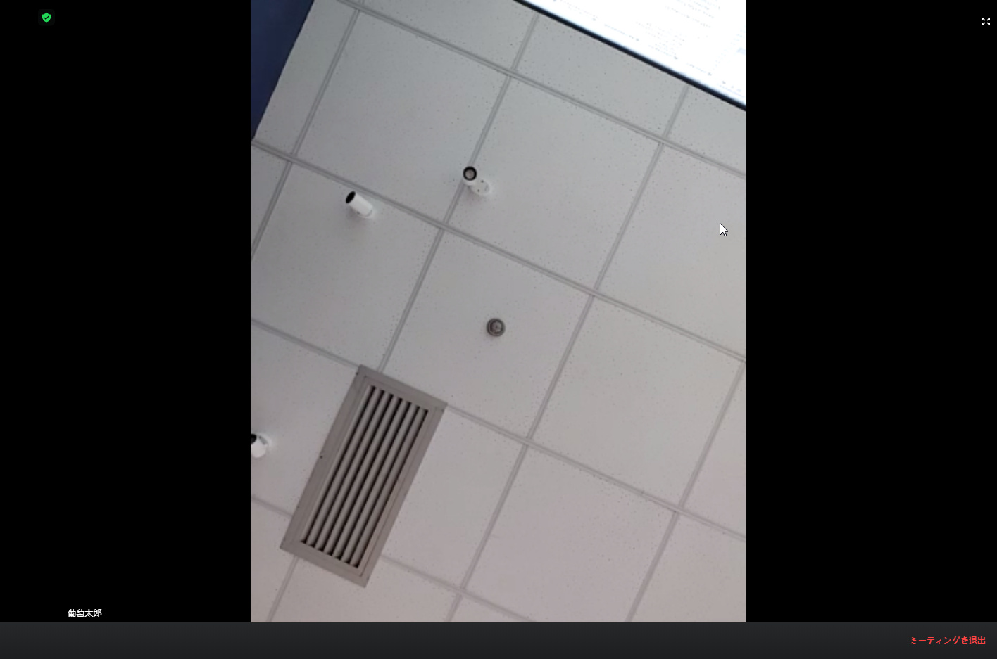
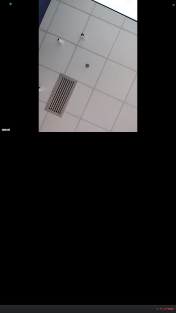
Screenshots
Smartphone (please complete the following information):
Other
Translated by Google
tommy
June 16, 2020, 5:41pm
2
Hey @spirit.ling.pub ,
Did you set any other CSS? Please provide steps to reproduce, or your CSS code so I can debug.
Thanks,
NO, I didn’t change anything, there was a problem with the preview on my phone。
I see that you do not support responsive
tommy
June 18, 2020, 11:15pm
4
Hey @spirit.ling.pub ,
The Web SDK for the most part is responsive.
Please try adding this to index.html:
<meta name="viewport" content="width=device-width, initial-scale=1.0">
Thanks,
You see the content of my question, I wrote this code, and my code is relatively complete. I also tried this, but unfortunately, it was useless. I read your other questions and said that it does not support mobile web adaptation
Translated by Google
tommy
June 22, 2020, 8:47pm
6
Hey @spirit.ling.pub ,
We will work on making the Web SDK more mobile friendly.
Thanks,